Thursday, April 23, 2015

Pride film trailer analysis- NATIONAL/REGIONAL identity

The first shot of the trailer is a black screen establishing location, 'in a small Welsh mining village', then an establishing shot showing the misty Welsh land, then another black screen saying  'deep in the valleys' which is how Wales is often referred. Further shots of Welsh countryside, shown to be misty and grey. Then we see some interior shots of the community hall where the people eat together and all appear to know one another, a stereotype of small towns. The gay group are shot from a worm's eye view to show the power they will have over the destiny of the mining community. The reaction shot of the elderly lady shows this town and its residents are unused to trendy gay people, which points to the stereotype of small rural towns as being old-fashioned and conservative. The gay group members' own apprehensive faces show that they are ware of the possibility of awkwardness between the conservative villagers and their group. As a member of the LGBT+ community even today, entering small villages full of elderly people is intimidating, so in the 1980's this would have been more pronounced. The next shot of the silent community hall full of stone-faced villagers looking at the gay group shows the divide in this country between metropolitan trendy forward-thinking LGBT youths and older more traditional conservative types. The next sequence of the main characters in the kitchen is further reinforcing this, as the villagers stand on one side of the kitchen and the gay group stand on the other. This is when the difference in their mode of dress is obvious, as the villagers wear earthy shades and corduroy and have sensible, natural hair, whereas the gay group have styled hair, some dyed and they wear more trendy clothes. This use of mise-en-scene makes it easy to differentiate groups, even for someone unfamiliar with the characters.
There is then a letterboxed shot of a white background with red text telling the audience that it is based on a true story, which would make it more interesting for a British (especially Welsh) person to watch, as they may be unfamiliar with the story and will want to find out more OR they could remember the events and wish to relive them via the media of film.
The rest of the trailer serves to show off funny parts of the film to draw in audiences and plays on stereotypes of the British gay scene in the 1980's being vibrant and fun, as the old Welsh women seem to have a rollicking good time dancing in the gay club. This segment also plays on the stereotype of the British gay scene (and British people in general) being very chilled, as the elderly village women seem to have no qualms with being surrounded by men in bondage gear.
When the characters return to go to bed, the young women and the elderly women share bed space and laugh together about sex toys, which comments on the tendency of women being more open with one another about personal matters, while the men are downstairs wishing for some peace and quiet. 

Thursday, April 16, 2015

Daily Mail analysis

The large, eye-catching headline juxtaposes 'jihadi' with 'labour' in order to back up the feeling shared by most Daily Mail readers that the Labour party are untrustworthy & dangerous. The use of the large photograph of Ed Miliband with the runaway's father is the main photo above the image of the actual runaway himself. He is the one who left for Syria & was arrested, yet his father is placed above him & larger as he is the one with Miliband. The Daily Mail loathes Miliband & Labour in general, so they would take any opportunity to tarnish his name & reputation. For a casual viewer who glanced at this cover, the headline & the image could give them the idea that Miliband was complicit in the young man's trip to Syria, which is most likely ridiculous, so their convictions that Labour were bad news would be reinforced. The mode of address is semi-formal, as if they were trying to educate you but had ended up screaming angrily instead of remaining objective. Instead of the refined image Tories like to show the world, the Daily Mail are more like screeching, ignorant, racist grandmothers & if I were a Tory, I would be ashamed. This newspaper is aimed at similarly screeching "I'm not racist BUT" types who are from 35-70, mostly male, upper working to lower middle class. 

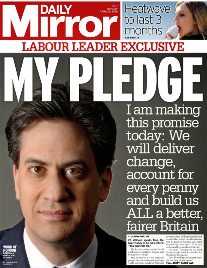
This Daily Mirror cover contrasts hugely with the Daily Mail, as Mirror are Labour supporters so portray Miliband in a very positive light. His face takes up almost half of the page, his expression is friendly but earnest but determined & the lighting makes him look serious & ready to act on his pledges. It is a very flattering image, as Miliband has a rather unusual face which can easily look sinister (see Mail cover above) & his Muppet-like face is often a source of mirth for non-Labour supporters, so the use here of a very flattering photograph shows that these media producers support him & take him seriously, so they use this kind of imagery to encourage their readers to take him seriously too. The use of a quote from Miliband himself makes the reader feel as if he is talking right to them & the use of eye contact with the camera makes it feel more honest & thus, more positive & personal. 

Thursday, March 5, 2015

Negative vs positive representation of Asian men on TV

The Big Bang Theory
Raj in TBBT
In The Big Bang Theory, a popular American sitcom, the only main Asian male character is shown to be unattractive to women most of the time & hopeless with romance. This is a negative stereotype perpetuating Western media; the unattractive Asian man who could not possibly be good enough for a woman, especially a white woman. Studies have shown that Asian women are often sexualised in the media as an object to be coveted by a white man from an Asian man, who is always shown to be either abusive towards the Asian woman or inept as a partner, with the white man effectively 'saving' her from the useless/nasty Asian man.
In non-western media, this is a foreign concept, as can be seen in popular Korean drama Boys Over Flowers, where the female protagonist, Geum Jandi, has to cope with being enrolled in a snobby new school whilst fighting off the affections of Gu Jun Pyo & the stunning 'Flower 4' (the most beautiful boys in the school) & the jealousy of their league of female admirers. These Asian men are shown to be attractive, popular, socially charming & desirable in every way.
The Flower 4 winning (& breaking) the hearts of every girl except 1

Tuesday, March 3, 2015

Ethnic representation in music videos

Hungry Like The Wolf- Duran Duran (1982)
Music video by Duran Duran for Hungry Like The Wolf (1982)
This video was entirely filmed on location in Sri Lanka. The band are all young, white males which makes them stand out as they are culturally other from the Sri Lankan locals. The locals are shown to be poor & old-fashioned compared to the band members, as shots of beggars & hard-working market-stallholders are juxtaposed with the glamorousness of the band. The Tamil military presence is shown which would truly show a predominantly white British audience that Sri Lanka was a very different world, as Britain is not generally policed by military officers. The country is shown to have many mystical & mysterious properties & inhabitants, such as the snake charmer, the lush jungles that hide all manner of creatures (including an elephant) & the lead female dancer in the video. This video became hugely popular amongst young white people as it is a classic example of white wish-fulfilment adventurer fantasy, as the band (especially lead singer Simon LeBon) are shown to be intrepid explorers in an exotic land in the manner of Indiana Jones. This contrasts with the locals who are all getting on with their day-to-day lives, almost to comic effect as the melodramatic flailing of Simon as he 'hunts' the woman is aided by nonplussed Sri Lankan children who can tell he obviously has no idea what he's doing & is totally out of his depth. The woman he chases is represented as the stereotypical exotic black woman. She is painted in 'traditional'-looking warpaint & juxtaposed with images of a leopard, showing she is animalistic & mysterious like the endangered animal.  The townspeople are shown to be hard-working in their bustling market in the middle of the lush green jungle, while both the jungle & the market are shown to be obstacles to the white man's conquest.

Paper Planes-MIA (1982)
Music video by MIA for Paper Planes (2007)
This video by British & Sri Lankan singer MIA is a positive representation of a woman from an ethnic minority, as MIA is shown to be independent & optimistic despite working in a sandwich van (probably not a well-paying job) & hanging around in markets & subways. This video shows that she is optimistic & hard-working & does not let lack of money or status get her down. The lyrics reflect her social situation as she is not part of a wealthy elite but gets by on slightly illegal activities & personal enterprise. The song deals with themes of immigration, as MIA sings about VISAs & getting over borders, which can be read literally as immigrants crossing borders to become hard-working members of larger communities & also as immigrant people crossing personal & interpersonal borders (such as language barriers & being the subject of racism) with hard-work & a positive outlook. MIA is a rap star, but in this video she is working hard in a menial job, which shows how one cannot reach the top unless one is prepared to work really hard, especially if one is from an ethnic minority.

Thursday, February 26, 2015

PIES task

PERSONAL IDENTITY
The Rocky Horror Picture Show
Trailer for TRHPS
I identify strongly with this film as Each character reflects a part of my personality, as does the general aesthetic of he film. Frank is fabulous & mysterious, as I would like to be; Brad represents confusion (I am often confused); Janet is eager to learn new things; Dr. Scott is wise (as I often perceive myself to be); Columbia is devoted to Frank like a fan to a celebrity & I take my fandoms & celebrities very seriously; Magenta & Riff Raff are under-appreciated & quietly bitter; Rocky is pretty & sometimes I think I am pretty. The castle is gothic, like me, but inside it is like a mixture of a theatre & a laboratory. TRHPS has a huge cult following as many people are able to identify with the pop-culture B-movie references, the characters who at first seem very basic but are in fact very complex & the music which covers a range of styles from rock'n'roll to Vaudeville. Some audiences take an oppositional reading to the sexual elements & the seemingly degenerate actions of the characters.

INFORMATION
  

Tuesday, February 10, 2015

Shot by shot analysis of first 5 mins of Butterfly on a Wheel (2007)

Butterfly on a Wheel on BBC iPlayer

The first shot in this film pans from black to a midshot of the sleeping woman. The room is hers, as we can tell from the mise-en-scene of the floral, rumpled quilt which shows that she is comfortable here. The low-key lighting shows that the scene is set at nighttime. As the camera continues to pan, the mise-en-scene shows her personal effects in the room, including a framed photograph of her with a man, presumably her husband from how close they stand & how they smile.

Tuesday, February 3, 2015

This Girl Can

Women are represented in this video as being determined & unafraid, as they are having to endure intensive sports whilst battling the ingrained & internalised negative body image all women are faced with from the day they are born. Many of the women in the video are plus-sized. Almost 57% of women in the UK are overweight, but the prevailing media representation for slim women, so larger women are often bullied & wrongly made to feel imperfect or not beautiful enough. This creates a vicious circle which means larger women are afraid to go to the gym as they would be more likely to receive unwanted attention, so the video is showing a large range of women of different sizes all exercising together, free from the judgement & hostile competitive nature often encouraged in the media, to encourage women, regardless of size, shape or level of fitness, to go to the gym or otherwise exercise in a way that makes them feel good. The video contains lots of close-ups of slow-motion legs & bottoms jiggling, as this is often a huge area of insecurity for women, but these shots do not show this in a negative light, rather as a proof that one is working hard. Slowmo closeups are usually reserved for the 'perfect' breasts & bottoms of models, so this technique shows that these different-sized women are all just as beautiful as models.  

Thursday, January 8, 2015

article text for double page spread so far

The Goth scene has always been revered as a safe and inclusive place for all. Be you Trad, Cyber, Victorian, Lolita or Nu, each and every one of us has a place in this vibrant community. Goth clubs, as such, are places of trust and safety, a safe-haven for people (especially women) who would otherwise be victims of harassment and even, as the shocking and tragic death of Sophie Lancaster proved, violence. LUCY, the UK’s pioneer of altsub information and rights, has a lot to say about this. With over a million subscribers on YouTube, her sharp wit and cutting-edge attitude puts her at the forefront of British alternative subculture.

So what better place to meet her than the local church? Centuries of wear have rendered it an intimidating sight and an excellent catalyst for discussion and change. The sandstone steeple looms ahead, its ancient belfry all but lost in the mist. It is 6am, the sky is overcast and the stone upon which I have perched is cold and damp. A hardly ideal condition to conduct an interview, but this issue’s guest is certainly worth the discomfort.
A minute passes, and another, until -finally- my esteemed guest materialises from behind the thick wooden doors. She waves cordially and offers a hand.
Good morning, LUCY. How are you today?
I’m very well, thank you. I think the meeting went well, everyone listened to one another. It was good.
I see. Is the meeting secret, or are we allowed to know what it was about?
Well, you’re the first on the scene, I guess, so it’s a bit exclusive. It was actually a conference discussing the proposed changes to hate crime laws.
Oh! That explains the banners for The Sophie Lancaster Foundation.
Yes, that’s right. After Sophie’s death, her mother has been bravely campaigning for the Hate Crime Act to cover alternative subcultures and modes of dress. In short, if someone beats you up ‘cause they don’t like the way you dress, they can be prosecuted more harshly.
That’s a godsend to people like us, then.
Exactly. One of my rivet head friends was glassed in Shoreditch a few moths ago, when some yobs didn’t like the way he was dressed. He had to have stitches, but the lads got off with community service. It’s awful, this kind of prejudice can’t be allowed to continue and it looks like we won’t have to wait much longer.
I think all of our readers will agree with you there. Shocking acts of violence will no longer make us live in fear.
No, exactly. People like us deserve much better. I was discussing this with the promoters of Slimes and they’re all vehement supporters!
By Slimes, I presume you mean Slimelight? (Longest running dark club night in the UK)
Yeah, of course. It’s great there. In fact, that reminds me of something…
That ‘something’ wouldn’t happen to be your next video?
It would, as a matter of fact. It’s not out yet, but it’s about the link between feminism and Goth I went to Slimes with a few of the girls the other week and was really struck with how safe it is. It’s not like the run-of-the-mill nightclubs, where there’s the constant fear of being leered at or touched by sexist blokes who see the lace and the fishnet and instantly assume you’re some object. Everyone at Slimes, or any other altsub night, is there for the same reason: to have a good time in a safe environment. They’re not perving on you, they’re not going to assault you. The bathrooms are all basically unisex and it doesn’t even feel weird, it’s just normal.
Would you say Goth men are more likely to be feminists?
I would say Goth men have the attitude of a feminist, but they might not realise it. It’s so internalised in this culture, so normal. If a Goth guy was acting like a sexist pig or treating women like sex toys, he’d be the freak. In a mainstream club, it’s seen as ‘manly’ or ‘cool’ to pinch a girl on the bottom (which is actually a criminal offence) and when she complains, they tell her she was ‘asking for it’. This kind of disgusting, entitled attitude, in my experience, is all but absent from Goth and alternative clubs.
You’ve been to lots of clubs, then?
Oh yes. It’s all research, I can assure you! Good ones I can recommend are, obviously, Slimelight if you’re in Islington, or Invocation is another great one. If you can get to Chelmsford, I strongly recommend The Strange Boutique. It’s a new one, but it’s really good so far,
and the people who run it, Cassiel and Catherine, are
absolutely wonderful people.
In Cardiff, there’s a cool place called Bogiez, which has a good vibe.
Birmingham has a few good places, actually. It’s pretty difficult to decide which is the best. Eddie’s (once well-known Goth spot Edward’s No.8) is a surefire hit and it has a Goth room as well as plenty of metal. Scruffy Murphy’s is pretty good, with great beer. Rock Zombie in Dudley is quite new, but it’s showing heaps of promise.
That’s all we’ve got time for, I’m afraid. Thanks LUCY, it was great to talk to you.

Great to talk to you too.

Tuesday, December 9, 2014

Age representation in media- music video

The Beauty of Gemina-Stairs (official music video)

This music video tells the tale of a young boy living in the confines of a futuristic cult on an island, who, after the death of his mother, makes a daring escape & builds a boat to leave the island forever.
The young boy is represented as being more creative, free-thinking & moral than the adults around him & these qualities give him power where he otherwise would have none. The first shot we see of the young boy is a low angle, which makes him look important & in control, despite the fact that he is small. His overall is dark blue, whereas everyone else is clad in black, which shows how he is different from those around him. The next shot we see is the child ascending a staircase, holding hands with his mother. They enter a room & the mother has a blank facial expression, just like all the other adults. He brings her a glass of water & looks at her with a caring expression, showing that children are more receptive to emotional states than they are given credit for. he is then shown drawing a picture of a boat & his mother's face changes to a smile. She (& all the other adults) look blank & emotionless for most of the video, but the mise-en-scene of this shot shows that, even in this emotionally stunted atmosphere, a mother can still find joy through her child & his creativity. The next shot is in slow motion & it is a medium close-up of the mother kissing the child lovingly & smiling contentedly, as he is the best thing in her repetitive, boring life that is void of sensation & happiness, save for the joy brought by her son.
The next shot shows the dark, staring faces of the adults, which represents adults as being almost like robots; stationary & basically dead until they are needed, with little vitality. The slow pan over their relentlessly staring faces hammers this point home. This cuts to the mother working at her desk, surrounded by other people working, but she is working on schematics for the boat her son designed, showing how children can provide sparks of inspiration for the adults around them. Older people are stuck in their ways & sometimes struggle to break free of the societal constraints they have been conditioned into, so children can be a huge help for them, as their minds are free & untainted by internalised evil.
We then see the boy with two other children playing with an origami boat floating in a water basin. This boat is then taken & crushed in the hand of a faceless adult. The children were having fun & being creative, but the adults in a position of power stifle & crush this creativity, as they do not want individuals, but just more clones of themselves.
The next shot shows the mother being taken by two other adults into a small room. They shout at her & throw her boat schematics at her in a rage, presumably because any ideas about leaving the island are seen as treason. This representation of adults shows that they oppress not only children, but each other. The adults receiving the oppression just accept & internalise it, as they always have, whereas the children are able to rebel & escape this cycle of abuse.
The next shot is a close up of a shouting man, presumably barking orders that are televised throughout the complex on the island. Then we see two of the other adults sharing a kiss but being dragged away from each other, further reinforcing the representation in this video of adults oppressing each other. The woman then looks blankly into the distance, not into the camera.
Then we are shown an exterior of the complex, an ultra-modern sleek building but shot in very unsaturated colour so it looks dull. The windows seem to glow against the dullness, perhaps signifying that the people inside the building are not yet entirely void of light.
Then we pan into a washroom where various adults are composing themselves, but the mother of the boy is sitting on the floor looking forlorn & being comforted by another woman as a man hands her a bottle of pills. Then we cut to a sly-looking person looking into the camera, before returning to the mother, now dead after an overdose of pills. Her son crawls towards her. He is now all alone in the world, but he understands what his mother wanted of him.

Monday, November 10, 2014

some more photos

Photos I took when I went to see Deathstars, with support from In Dante's Eclipse & The Dead & Living. Most of the photos are not great quality, but the ones that are can be useful for my pre-production. I have included here the ones that were least blurry.


Thursday, November 6, 2014

Here are some of my own photos I will be using in my pre-production. They are all taken from a music festival I attended called SOS Festival. I will be featuring a review of this festival including some of these photos on a coverline of my preproduction cover. I am attending another gig tonight so I will be trying to take some more photos to use in coverlines.


Tuesday, October 21, 2014

Analysis of survey results

More females than males answered my survey & more 17 or under, many were not employed but looking for work. The maximum anyone would pay for a bimonthly alt subculture magazine would be £5, with most preferring under £3. Most of the people who have answered my survey so far identify as punks, with emo/scene/greebo & pagan/Wiccan/Faerie/Tribal tying at second place.Metal was third place. The other people were goth, cyber, Victorian, Fetish/BDSM, Dieselpunk & vintage goth. Nobody who has so far answered my survey is a rivethead, a lolita, a gothabilly or a vampire. Most people read Kerrang! with NME second, Classic Rock third & Classic Pop, Artrocker & Rocksound in joint fourth. One respondent said they feel the magazines they read do not cater enough for the subculture side of the BDSM lifestyle & worried that most magazines that even acknowledge BDSM will refer to 50 Shades of Grey, which is not about BDSM, but abuse. One respondent said that Kerrang! spends too much effort giving fanservice of popular bands just to attract their fans to the pictures. When asked what they would like to see in a new magazine, respondents replied:
accurate representations and explanations
Other sections like Cult Classic films
Something which touches the heart of the subcultures giving a realistic view as opposed to an over romanticized view.
free cds, tour dates
More independant, unbiased critique of bands. A solidified section involving the up-coming talent. Perhaps a section devoted to what gigs/events are going on in each area in the proceeding month.
Tips on how to work your style and places to shop. Some horoscopes and witchcraft practice would be awesome.
Tips
Old and new information about modern and classic bands, movies ext..Also recommended movies, shops and bands would not only be useful, but interesting

When asked what bands they would like to see on the cover, people replied:
Speaking in Shadows
Slipknot
brand new (note- I think they mean the band Brand New, but they might also mean they want brand new bands on the cover. I'm going to go with the band.)
Romantic (note- I am not sure whether this person means the band The Romantics or if they mean romantic or New Romantic music. I will endeavour to feature both)
Whoever has made recent notable achievements
Paloma Faith
either the Cure or Bauhaus

Below are the results of the poll.


Monday, October 20, 2014

Textual analysis on Kerrang! magazine


Kerrang! is a weekly hard rock music magazine & the most popular music magazine in the early 2000's. Kerrang! is often criticised by fans for their immensely biased critiques of bands, pandering to the fans of a certain band & treating them as godheads one moment before forgetting about them to move onto the next. This is no concern of mine, especially since I have rarely listened to the cover stars on Kerrang, hence why i chose this cover to analyse. I am familiar with Rammstein & they were the closest thing to a band popular in the gothic subculture I could find. The covers of Kerrang magazines are always quite busy, with this one being surprisingly restrained compared to some I have seen. This is because the magazine appeals to people aged between 13-25 mostly, as these are the people able to see the most & they would want to have a busy cover to hold their attention. My magazine will be appealing to more older (middle-aged people & people in their 30's make up the bulk of the subculture these days) so I will not make it as busy as Kerrang but certainly more busy than Propaganda (see previous post), the minimalism of which worked well in the 80's & 90's, but probably not as well today. A good point about Kerrang that I will use is the range of information, from bands & gigs to festivals, competitions, interviews & posters. I would like a similar wide range of features in my coursework. 

Thursday, October 16, 2014

Textual analysis- Propaganda magazine

Propaganda was the longest running & best-loved gothic subculture magazine in the USA & probably the world, dealing with gothic & darkwave music, fashion, nightlife, BDSM & fetish & counterculture. The logo for the magazine was the Totenkopf, or death's head, a skull symbol made famous by the SS & the controversial leftist neofolk band Death in June. This flirtation with fascistic imagery is a trademark of gothic counterculture, provoking controversy, confusion & misunderstanding for those not in the know & acting as a bold statement to those in. This marks the magazine out immediately as something against the mainstream & only for those in the know, intimidating & putting off those not. The coverlines are very short & snappy & would probably be incomprehensible to people who were unfamiliar with the context. 'Bauhaus' to a casual observer would either mean the German design school or just a strange German word, but to members of the Goth subculture it is the name of the first trad. Goth band & one of the most important bands for the subculture. The Cult is more obviously the name of a band, but maybe one that a casual onlooker would not be familiar with. 'Hanoi Rocks' could be referring to the city of Hanoi being very vibrant, but it is actually the name of a Finnish glam-metal band in this context. The smaller coverlines running up the side of the main image are similarly ambiguous to a casual observer, as Tones on Tail would probably not be known by most casuals, neither would Einstuerzende Neubaten (here shortened to Neubaten), a German industrial band. Then the coverlines diverge into features other than bands & into subjects important to goths: Berlin club nights, New York style & fashion (presumably gothic fashion). The main image itself is a typical Prop cover, with an androgynous male model sporting a deathhawk & dramatic, almost Kabuki-style makeup, kissing a mirror in a club bathroom (an environment familiar to goths). 

Textual Analysis on Bizarre Magazine

Bizarre is an alternative subculture monthly magazine aimed at adults (18+) in alternative subcultures. Most covers of Bizarre are adorned with very risque images of partially clothed women with large breasts, usually with fetish & latex style clothing, as the BDSM & fetish subculture is catered for in this magazine (the only mainstream magazine to do so), but that is not relevant to my project as I am aiming for ages 15+ so prefer my cover stars to be clothed, hence why I chose this issue where Kat von D is the covergirl. She is dressed in relatively gothic clothing, so this cover looks more like what I will be going for with my own work. The puffs all contain names of people likely to be known by people in alternative subcultures, such as Kat von D, Jonothan Ross, Nikki Sixx & Chuck Palahniuk, so they immediately draw the eyes to these names & the small descriptions of their contributions, which makes the viewer (probably interested in at least one of these names) want to look inside & then buy the magazine. Lots of reds are used, so the black of Kat's hair & outfit stands out more, especilly against the off-white background. Many members of alternative subcultures are interested in body modifications (tattoos, piercings, scarification, implants etc) so the top line of the cover being about tattoos, leading to the large image of Kat (one of the most famous tattoo artists today) would immediately interest anyone interested in body mod. The pictures & the puffs surround the image of Kat tightly, but not so much so that they distract the viewer to annoyance.